Wednesday, June 30, 2010

Back in the Saddle Again

For those of you that know me, I once was an avid scrapper (averaging about 3o layouts a month). Due to some personal issues, I decided a little over a year ago to quit scrapping- cold turkey! Now that I'm trying to get "back in the saddle" so to speak, I'm finding my "mojo" is lacking. So I thought I would share with you today some things that have jumpstarted my inspiration.

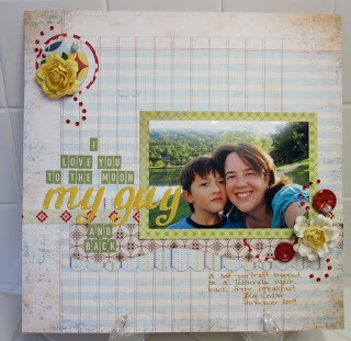
First off, the June kit- Au Revoir- that Michelle and Dolores put together was FABULOUS! The papers from The Girls' Paperie were a real "mojo" booster! The mixture of reds, blues, and yellows were a delight to work with. I love building my page with patterned paper as the base. This sheet of ledger patterned paper in the kit was perfect to use for this layout I did of my son and I.


I knew right away when I saw this paper in the kit I wanted to try one of the new trendy banners I've seen around on other scrappers' layouts. I dug out my trusty X-acto knife and sewing machine that had been collecting dust for this layout of my grandfather. I hand cut the pennants, secured them with a small glue dot, and then did a simple machine stitch along the top. I'm very pleased with the results. I think the banner adds a nice touch and adds to the sea/naval theme of the layout.


I always find that when I'm lacking inspiration, a sketch helps get me started. I've been enjoying participating in some sketch challenge blogs. Both my Sea Scout layout and the following Hammerhead in Training were based off of a sketch. I thought I would share a few sketch sites....some I'm sure you've heard of, others maybe not.


Today ends my Guest DT month at Timeless Daydreams. I want to take this opportunity to thank Dolores and Michelle for choosing me. It's been a long time since I've done any "DT" work with a kit. It was a refreshing step back into the scrapping world. If you've not gotten yourself one of the Au Revoir kits, I encourage you to hurry up and grab one before they're gone!

Peace out,
Amanda


Tuesday, June 22, 2010

Meet your June Guest Designer ~ Amanda Laboy

We are thrilled to have Amanda Laboy as our June Guest Design team member. 

Grab yourself a quick drink and settle in to learn more about Amanda.

Hi, my name is Amanda Laboy. I'm an elementary music school teacher by day. I live in Oklahoma with my hubby of 10 years and our son who just turned 8. I've been scrapping for the past 9 years or so. About 20 albums later, I now try to squeeze in scrapping a couple of times a month. My favorite scrappy colors are orange, green and teal. I love everything Fancy Pants, Sassafras Lass, and Cosmo Cricket. I'm excited for this opportunity to scrap with the kits from Timeless Daydreams!!!

We tossed some questions in the air and pitched them over to Amanda, here's what she had to say.

Where do you get your inspiration?  I enjoy looking at other scrappers' blogs and galleries.

What is your favorite embellishment?  Either letter stickers or anything chipboard

How long have you been scrapbooking?  Off and on for about 11 years.....although, I did find some old "scrapbooks" I kept when I was a kid.

If you could choose one manufacturer to receive a free years supply of product from, who would you choose?  Hands down, it would be Fancy Pants!  They fit what I consider my style the best.

Do you prefer dinner at home, take out, or eat in a restaurant?  Most days, I prefer dinner at home.....of course, it doesn't hurt if someone else did the cooking :)

What is your favorite color and why?  I LOVE orange and green the most......but really I love all colors.

How do you overcome Scrapper's Block?  I find a sketch that I like and base a layout off of it.....it also helps if I have some recent photos that I absolutely love.

What’s the last song you downloaded to your ipod – or the song you just can’t get out of your head right now.  For Good from the Wicked soundtrack

The words that would be describe my style are ………………………………………. sometimes shabby, sometimes vintage, sometimes simple and sometimes funky....if that's possible!

If you could only have three tools to scrap with - what would they be?  My Xacto knife, glue dots, and my circle cutters......I actually don't use very many tools when I scrap.

Name a food in your house you never run out of.  Does coffee count as a food? (Most definitely! It's a staple in my house as well.)

If you lost your sight tomorrow how would you express your creativity?  Probably through music and dance.  I enjoy both.

Name something that makes you smile when you see it.  My son and/or husband when they are laughing.

I loved learning more about you Amanda!
Stay tuned for layouts from Amanda and the rest of the Design Team coming soon!

Thursday, June 17, 2010

Au Revoir ~ June kit is in the store!

Au Revoir! Presenting Girls Paperie's ON HOLIDAY!
No we are not saying Goodbye, but HELLO to our bright and splendiferously gorgeous June kit.
In the kit you will find product from 7 manufacturers! 

Girls Paperie 
5 Thick Double Sided patterned papers
1/2 yard of 4 Grosgrain patterned ribbons
Pink Paislee
1 Die Cut Scallop paper
American Crafts
Dear Lizzy Puffy Thickers (letter stickers)
Prima
1 pack of Lemon Creme Trellis Roses
Jenni Bowlin
Red Vintage Style Sew on Buttons - 1 package
Red Crepe Paper Ribbon - 1 package
4 Pearl & Rhinestone Pins - Cream
Kaisercraft
1 pack Red Rhinestones - 100 pack
Bazzill
2 Textured patterned papers

Keep your eyes peeled here, on the Timeless Daydreams Gallery, and on the TD Facebook page for work featuring this gorgeous June kit, which is available NOW in the store.

Oh yeah, and there are new goodies in the store, as well as a new Creative Thursdays Challenge on the Timeless Daydreams Forum.We would love to have you stop in and create with us.

Wednesday, June 16, 2010

Congratulations!

A big congratulations goes out to our new Contest Coordinator!!

You all sent in great applications!
Thank you - you are all great ladies which made it very difficult to pick someone to join our team.
So without further ado....
Please join me in welcoming Jeri aka scrappinhero to our Daydreams family as our Contest Coordinator! Stay tuned for new contests in our Contest section. We hope you'll all join in for fun and of course cool prizes!! Happy Scrapping!!

Sunday, June 6, 2010

Quick Contest! Ends today Midnight EST.

In honor of naming of Contest Coordinator this month!
We are going to have a Quick Contest!
You all know that cute little box on the right side of the forum main page that tells us who are the TOP POSTERS for the day, well whoever is our Top Poster by Midnight Eastern Time wins a cute Maya Road Vintage Purse Album!
I'm going to post a pic in the forum under our Contest Section.
**GDT and Admin and Staff will not be counted in the Top Posters**  Sorry Ladies **
Link directly to Forum Topic for Contest!

Thank you and Happy Posting!!
Hope everyone had a great weekend!!

Friday, June 4, 2010

Cropping layouts in Paint Shop Pro

We were recently asked how we crop our layouts on the TD forum. I work with both Paint Shop Pro X2 and Photoshop. For some reason I prefer PSP for cropping my layouts, and defer to PS for editing photos. You can click the links above, and test the trials for the new versions of these photo editing programs.

Today, I will walk you through how I crop a layout for posting online. I'm sure there are lots of different ways to achieve this, I'm just sharing how I do it.

Try as I might, I never can fully get 100% over top of the layout when taking a photo of it, to get that perfect crop, and without the camera lens distorting my layout.

Below is a photo straight out of the camera.
The bottom portion of the layout if you look closely, appears to be wider and more turned up than the top portion of the layout. If we want to fix this to get a near perfect crop, we have to straighten the layout up a bit.
In PSP (Paint Shop Pro) there is a tool called a straighten tool. You can either straighten the layout horizontally, or you can use Perspective Correction to straighten all the sides. That will get rid of the distortion caused by the camera, and by us not fully taking the picture directly over top of the layout.
It is the 6th tool from the top, we'll be using perspective correction.  (If you hold your mouse over the little arrow, you will get the drop down menu as shown below)
When you select it, you will see this on your image. Click the image to enlarge it.. the tool places itself on your photo. See where the arrows are pointing to?

What we need to do, is zoom in a bit, and align all 4 sides of the tools lines with the 4 sides of our layout.
I zoom in until I can clearly see the edge of my layout against the background. The, you just grab a corner of the perspective correction tool, and drag it to one corner.
 I always start at the top left of my layout, and work clockwise. Keep dragging the little square to the corners of your layout(there are 4 squares for each corner of your layout)... making sure you get as close to the edge of your layout as possible. You can click the photo to view it larger...
Once you've outlined your layout with the perspective correction tool, double click.
You may not be able to actually see the difference, but once you are ready to crop your layout, you should be able to get a clean crop, so none of your background shows behind your layout.
Before we go any further, we need to make sure you have your tool palette options showing on the ribbon above. To make sure your tool options are available, go to View->Palettes->Tool Options. Make sure there is a check mark beside it.
Now, select your crop tool, 5th tool from the top.
Before we crop, we need to tell our crop tool what size to crop to. So on your ribbon above, look for the tool options for your crop tool. (highlighted below)
You want to change the numbers for width and height to 600 x 600 pixels, then check the toolbox to maintain aspect ratio. (this will give you a perfect square as you drag the crop tool around your layout.)
Now, position your crop square at the upper left corner of your layout, then drag the bottom right corner of the crop square to the bottom right corner of your layout.
Everything that is shaded, or darker, will be cut away. Everything inside the lighted area is what will be kept.
When you're ready hit the apply check mark button (the green circle) or double click your mouse.
You should be left with just your layout showing.  Now it's time to resize for uploading. Click on Image->Resize.
Put in your dimensions in the middle section. I usually save as 800x800 or 600x600.
Then save it!
You should have something like this layout, cropped close without your background showing.
If any of you use Paint Shop Pro, I hope this helps you a bit!
Happy Friday!
xoxo,
Leah